

A new year brings a natural desire for renewal. Whether it’s a full home makeover or a simple refresh, January is the perfect time to reimagine your space with intention. Thoughtful design choices can transform not just how a room looks, but how it feels.
This year, we’re celebrating mindful interiors by pairing six of our sustainable wallpapers with timeless Farrow & Ball paint colours. Each combination is designed to work in harmony, creating rooms that feel elevated and cohesive.
Pairing wallpaper with the right paint colour can completely change a room’s mood. While wallpaper adds depth, texture and personality, paint provides balance and breathing space. When chosen carefully, the two work together to enhance natural light, highlight architectural features, and create a sense of flow throughout your home.
All of our wallpapers are produced using eco-conscious materials and processes, so you can start the year knowing your design choices are as sustainable as they are stylish.
Perfect for: Living rooms, dining spaces, nurseries or statement walls
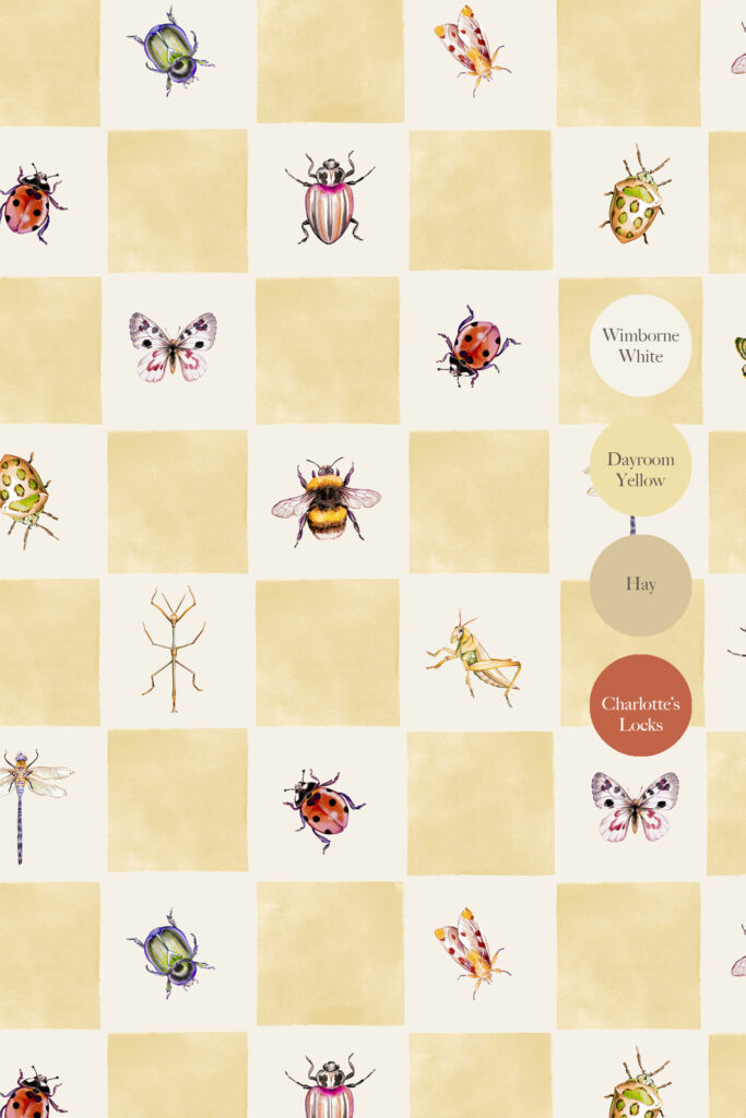
Our beautifully hand-painted Jude wallpaper, perfect for feature walls, nurseries, garden rooms, or creative spaces, pairs perfectly with Farrow & Ball’s Wimborne White, Dayroom Yellow, Hay, and Charlotte’s Locks.
Use the wallpaper as a feature wall, and paint the surrounding walls or woodwork to create a balanced, cohesive look that won’t date.
Perfect for: Living rooms, dining areas, entrance hall and bedrooms.
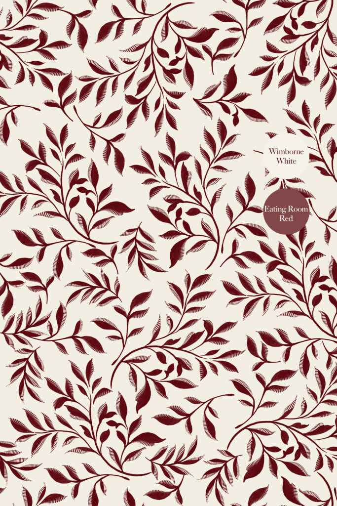
Our elegant and timeless Marni is inspired by the iconic Arts & Crafts style of William Morris and pairs perfectly with Farrow and Ball’s Wimborne White and Eating Room Red.
For a timeless, enduring pairing, this is ideal. If you are looking for something dramatic yet also classic and calming, this combination ticks all the boxes
Perfect for: Living rooms, dining areas, entrance hall, bedrooms or creative spaces

You are spoilt for choice with paint combinations with our stunning Orla Light wallpaper.
This combination blends character with clarity, pairing Orla Light with the grounded warmth of Farrow & Ball’s paint matches. It’s a pairing that inspires creativity without overwhelming the space (and you can be as bold or as subtle as you would like).
Perfect for: Hallways, transitional spaces, Kitchens, bathrooms, bedrooms, and Living Spaces
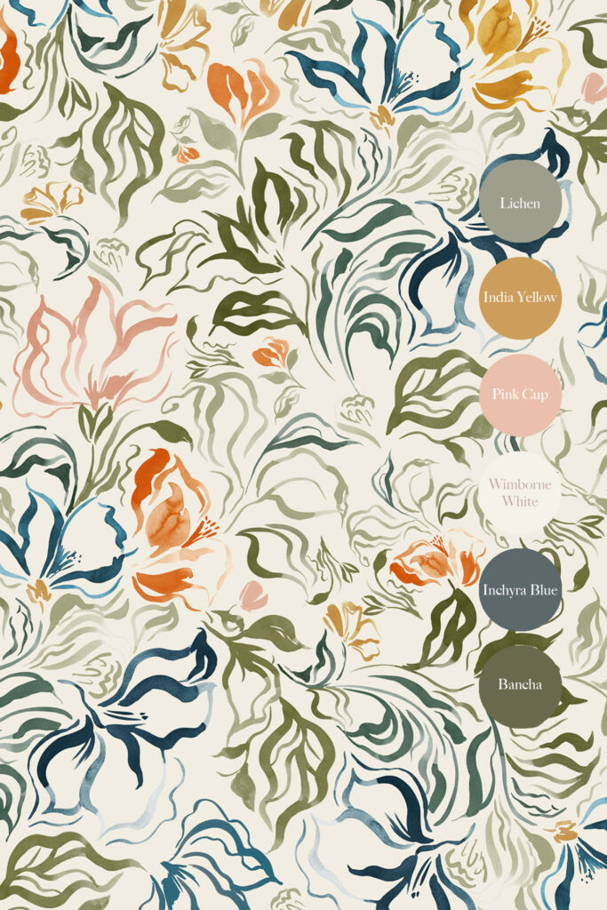
This pairing makes a strong first impression, combining Eva’s visual interest with the subtle sophistication of Farrow & Ball paint colours. There is so much scope for this combination and how you choose to use the paint colours to elevate certain aspects of the Eva design. So much potential!
Perfect for: Hallways, transitional spaces, Kitchens, bathrooms, bedrooms, and Living Spaces
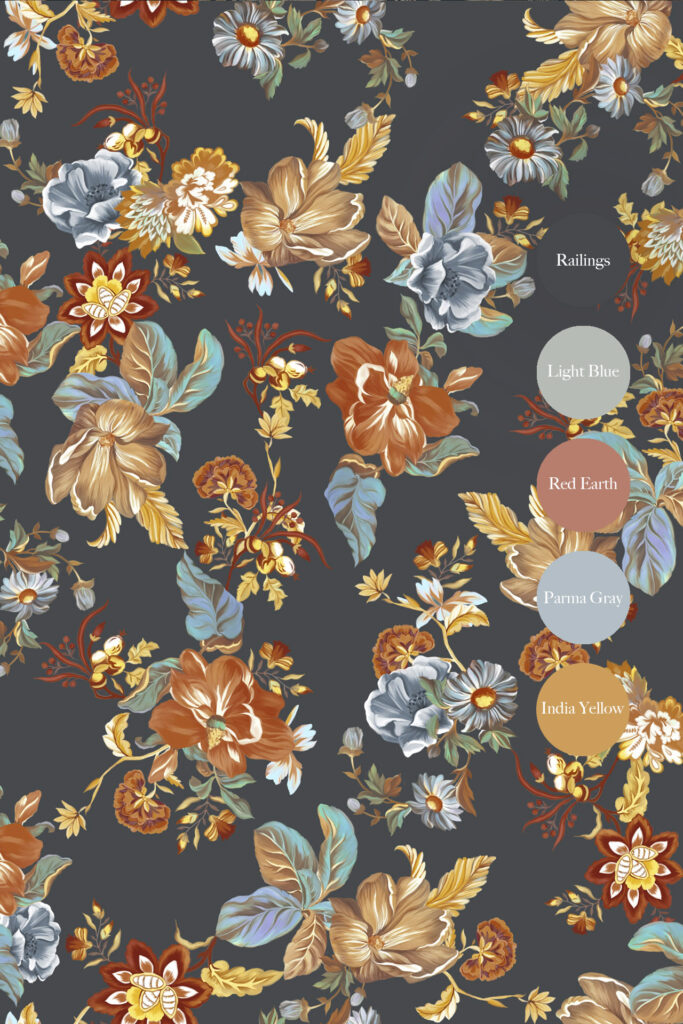
This duo is all about warmth and earthy character. The natural textures of Lottie Midnight work beautifully with the selected Farrow and Ball paint colours, creating a space that feels inviting and lived-in; perfect for gathering, cooking, and sharing moments together. Start the Year with Sustainable Style
Introducing wallpaper and paint in harmony can make a powerful difference. By choosing sustainable materials and timeless colours, you’re investing in a home that feels good now and for years to come.
Browse our wallpapers to see our full selection and the different colour choices for each of the wallpapers featured in this article (and don’t forget matching fabric is also available).